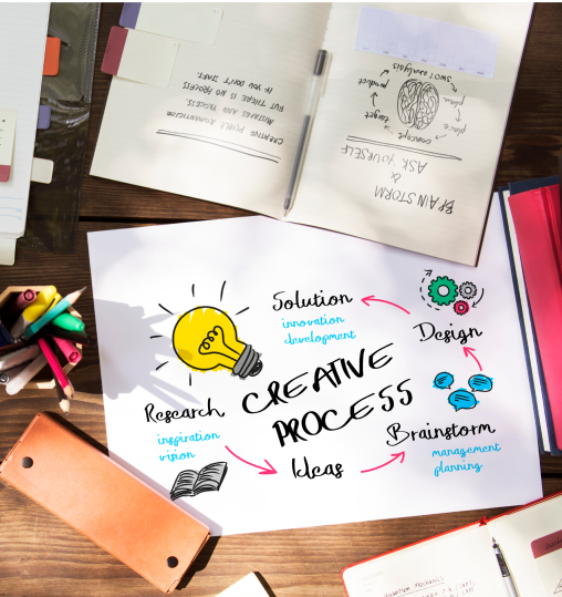
A Comprehensive guide to typography for Beginners
Jan 05, 2023 | By Aishna Pathak
Typography- The importance of typography can't be described in words. Rather, Typography plays an important and critical role in your Brands voice. It's something that keeps things creative, pretty interesting, attracts your customers while highlighting your central message!
When it comes to designing, every little thing or detail that we often fail to notice, matters. Good designing on your website, packaging, visiting cards, and brochures will attract customers towards your brand and create a good reputation for it in the market.
When you're laying out an email, presentation, or image on social media you need to pay attention to the tiniest detail of typography that can make all the difference.
What is Typography?
Typography is a way characters and letters are arranged in a certain way to make your information look appealing and attractive to people. Typography is used differently depending upon the viewers and the type of your service or business.

Why is Typography so important?
Typography is present everywhere, slipping out of our notice but attracting us to the information that was aimed to reach us. When we look at the information on any creative website, it automatically attracts us to read it because a lot of attention is paid on its typography, whereas, we often ignore the terms and conditions present on the websites or documents because of the poor and unattractive way of presenting the information.
Font, color, style, and setting might seem a bit unimportant to pay attention to but it could affect the way your information will appear to the viewers in both good and bad ways.

Here are the things that beginners need to know about Typography:
1. Get acquainted with the basics first
For the beginners of typography, it is important to know all the basics of it. Various things are part of typography and different tools are available that could be used to work with. Before starting designing, beginners need to be familiar with these things so that they could design unique and creative typography.
2. Font communication
Psychology is related to everything and even typography. There are a lot of fonts available for you to use but to make them effective and suitable for your work depends upon the viewers and their psychology. While designing, connecting to your viewers is important and that is possible when you choose the right typography to match their preference.
3. Limit your font usage
There are a lot of font sizes and styles available but a common mistake that beginners of typography make is that they use a lot of them and end up making their design look shabby more than attractive. It is therefore important to choose specific font and typefaces for all the headings and differently for the sub-headings and so on.
4. Alignment
Proper alignment makes your document look more organized and attractive. There are four alignments, center, left, right, and justified. You need to choose your text alignment carefully so that your design doesn't look like it is going in any direction making it confusing for the audience to understand.
5. Visual Hierarchy
In your text there are headings, sub-headings, some things are of great importance, and some that are not that important but still informative. Beginners need to understand the typography hierarchy which focuses on arranging the text and their font sizes in a proper order highlighting the more important things.
6. Font Pairing
Too many fonts are confusing to see because people can’t figure out what is part of which heading or what should they pay more attention to. When there are headings and sub-headings, their fonts should be paired and checked for compatibility so that they look good together and not unrelated.
7. Readability
Taking the example of terms and conditions once again, they are often ignored by people on the documents or website because they are mostly designed in an unattractive and unreadable manner. This may affect the impact that you are trying to create through your information and therefore, the readability is to be considered while designing the typography.
8. Font palette
Colors are related to psychology and define various moods of people. There are various combinations of colors that could be made but they should be used in the typography depending upon the viewers and audience. Kids won’t’ prefer seeing bold colors and adults won’t prefer seeing too many colors, therefore, the right font palette is to be chosen carefully while designing your typography.
9. Grammar
Poor grammar usage is not at all acceptable. If your information is written grammatically incorrectly, it will automatically eliminate the chance of building trust in your potential customers’ minds towards your brand. Therefore, beginners should be careful while preparing the typography and check for its grammar correctness through various apps and websites available.
These were a few of the things that beginners need to keep in mind before working with typography. Every small detail matters while presenting something and creativity is the key to make it effective. Beginners could take the help of the experts and designing guide to learn the basics of typography.
More blogs from us
The Power of Fonts: Exploring the Meaning Behind Font Styles
Jul 17, 2023 | by Sudarshona
Stay in Motion: Brands Nailing the Animation Game
Jul 03, 2023 | by Rahul Dhingra

Rebranding for the Win: Strategies to Stay Ahead in a Competitive Market
Jun 25, 2023 | by Rahul Dhingra

Artificial Intelligence in 2023: A Threat or an Opportunity?
Jun 09, 2023 | by Rahul Dhingra
Is Personalisation the ticket to Brand Success?
Jun 02, 2023 | by Rahul Dhingra
Branding Beyond Words - The most effective visual branding techniques
May 26, 2023 | by Rahul Dhingra

The Future of UX Design
Jan 03, 2023 | by Shreya Srivastava
What is Branding Agency and Why Branding Services is Important
Jan 03, 2023 | by Shreya Srivastava

7 Website KPIs To Help Your Business Grow
Jan 03, 2023 | by Aishna Pathak

Digital Marketing Agency in Pune
Jan 03, 2023 | by Shreya Srivastava

13 Design Principles - Fundamental Values that Help You Achieve Better Results
Jan 03, 2023 | by Shreya Srivastava

The Ultimate Guide to Instagram Influencer Marketing
Jan 03, 2023 | by Aishna Pathak

How to Write a Blog-Post: A Step by Step Guide
Jan 03, 2023 | by Aishna Pathak

Effective SEO strategy for brands in 2020
Nov 25, 2022 | by Aishna Pathak

How to target the right market?
Nov 24, 2022 | by Shreya Srivastava

The Ultimate Guide to Digital Marketing Career in India
Aug 24, 2022 | by Aishna Pathak

Best Modern Interior Designing Ideas Plus Tips On How To Accessorize
Aug 21, 2022 | by Shreya Srivastava

3 major reasons why blogging is good for your business
Aug 20, 2022 | by Aishna Pathak

Packaging- A Brand's Effective Marketing Tool
Aug 20, 2022 | by Aishna Pathak

What is Design System? Definition, Purpose, Benefits Explained
Aug 15, 2022 | by Aishna Pathak
The best creative design trends for 2020
Aug 15, 2022 | by Aishna Pathak

Website Builder v/s Web designer: What’s the best way to get a website?
Aug 14, 2022 | by Aishna Pathak

Brands that must begin implementing Digital Marketing
Aug 14, 2022 | by Aishna Pathak

History of Advertising in India- The Design Trip
Jul 30, 2021 | by Aishna Pathak

What is Visual Design And Why It is Important
Jun 12, 2021 | by Aishna Pathak

A Comprehensive guide to typography for Beginners
Jun 02, 2021 | by Aishna Pathak
Business Survival Strategy in Crisis through Online advertising
May 12, 2021 | by Aishna Pathak

30 Top Creative Logos of All time
May 02, 2021 | by Shreya Srivastava
Useful Chrome Extensions for Designers
Mar 20, 2021 | by Aishna Pathak

How To Hashtag Right On Instagram
Feb 02, 2021 | by Aishna Pathak

Steps to Follow Before Launching Any Product
Jan 21, 2021 | by Aishna Pathak

How Creative Digital Agency Services can Benefit your Business?
Dec 24, 2020 | by Aishna Pathak
Top 12 Web Designing and Digital Marketing companies in India
Jul 29, 2020 | by Aishna Pathak

Top 5 UI Design Agencies in India
Jul 29, 2020 | by Aishna Pathak
Role of User Experience (UX) Design in any Business
Jul 29, 2020 | by Aishna Pathak
13 Most Creative Design Agency Profiles on Behance
Jul 07, 2020 | by Aishna Pathak
Resources A Beginner should know before Learning UX Design
Jul 07, 2020 | by Aishna Pathak

Top 10 online platforms to learn UI/UX design
Jul 07, 2020 | by Aishna Pathak

Why do small details matter in UI?
Jul 07, 2020 | by Aishna Pathak

10 best remote work tips for Design teams in 2020
Jul 07, 2020 | by Aishna Pathak

Critical points in your design portfolio
Feb 25, 2020 | by Aishna Pathak

5 Things To Know About Social Media To Grow Your Business
Sep 30, 2019 | by Niddhi Bhangdia

Factors that have a strong impact in Building a Brand
Sep 16, 2019 | by Aishna Pathak

Importance of Consistency In Graphic Design For Business
Sep 10, 2019 | by Niddhi Bhangdia

The Ultimate Guide to Product Photography
Sep 05, 2019 | by Aishna Pathak

Importance Of Growth Hacking In Startups
Sep 03, 2019 | by Aishna Pathak

How To Design A Perfect Landing Page?
Jul 26, 2019 | by Niddhi Bhangdia

Google Introduces Mobile First Indexing
Jul 22, 2019 | by Niddhi Bhangdia
How Design & Advertising plays a Role in Setting up Cafe/Restaurant
Jun 04, 2019 | by Aishna Pathak

Upcoming design trends in 2020
May 31, 2019 | by Aishna Pathak

Digital Marketing And The Lok Sabha Elections: How It Affected The Outcome?
May 23, 2019 | by Aishna Pathak

How To Optimize Your Facebook Ads for Maximum Results?
May 09, 2019 | by Niddhi Bhangdia

How To Evaluate Your Branding Strategy
May 02, 2019 | by Aishna Pathak

7 Top Tips For Running An International Business
May 01, 2019 | by Aishna Pathak

Why Do You Need Social Media For Business?
Apr 29, 2019 | by Niddhi Bhangdia
Four Ways To Integrate Your Brand into Business
Apr 26, 2019 | by Aishna Pathak

Why Design And Marketing Should Work Together For Better Results?
Apr 22, 2019 | by Niddhi Bhangdia

Which Are The Qualities You Should Look For In A Graphic Designer?
Apr 18, 2019 | by Aishna Pathak
9 Factors To Consider for Designing a Great Logo
Apr 11, 2019 | by Aishna Pathak
When Is The Right Time To Re-brand Your Business?
Apr 09, 2019 | by Aishna Pathak

7 Easy Steps To Give Your Personal Brand a Makeover
Apr 05, 2019 | by Aishna Pathak

Top Tips For A Good Brand Building Process
Apr 03, 2019 | by Aishna Pathak

Boost Your Email Leads via Social Media
Apr 02, 2019 | by Aishna Pathak

Why Does Your Business Need a Social Media Manager?
Mar 28, 2019 | by Niddhi Bhangdia

Importance Of Branding for Your Business Explained
Mar 22, 2019 | by Aishna Pathak

Which is best: Traditional Websites Vs Marketable Websites
Mar 19, 2019 | by Aishna Pathak

Signs You Need a New Website
Mar 14, 2019 | by Aishna Pathak

Role of Creativity in UX Designing
Mar 12, 2019 | by Aishna Pathak

Why Security In E-commerce Matters?
Mar 06, 2019 | by Aishna Pathak

Top Mobile Travel Trends For The Year 2019
Mar 04, 2019 | by Aishna Pathak

What Is Ethical Branding And Why Is It Important?
Feb 28, 2019 | by Aishna Pathak
What Are Some Of The Most Effective Brand Management Techniques?
Feb 20, 2019 | by Aishna Pathak

Why to Use Infographics for Content Marketing?
Feb 18, 2019 | by Aishna Pathak

Importance of Blogging in Building a Brand
Feb 14, 2019 | by Niddhi Bhangdia
How To Create A Landing Page That Converts?
Feb 05, 2019 | by Aishna Pathak

How To Post Right on Instagram?
Jan 31, 2019 | by Aishna Pathak

Top Skills Every Content Writer Should Know
Jan 11, 2019 | by Aishna Pathak

The Best Free Fonts To Use For Every Designer
Jan 07, 2019 | by Aishna Pathak

Top Digital Advertising Trends of 2020
Jan 02, 2019 | by Aishna Pathak

The Must Follow Product Photography Tips To Make you look lika a Pro
Jan 01, 2019 | by Aishna Pathak

The Most Common Misconceptions About UX Design
Dec 27, 2018 | by Aishna Pathak

How To Create An Effective Social Media Strategy?
Dec 01, 2018 | by Aishna Pathak