The Challenge
Oblique Comforts is a business that is fast growing and draws clients by providing a wide range of products. They produce practically all types of chairs for trade, wholesale, and export. In terms of explaining to customers what the company is trying to say, our objective was to completely rebrand it and make it appear more modern.

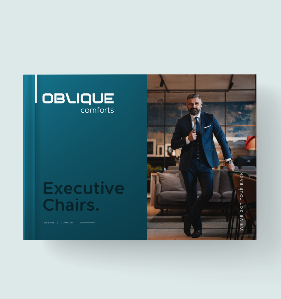
The modern design look
For the right colours, we took into account the atmosphere of their store. We chose dark teal green as the main hue to give it a contemporary appearance.
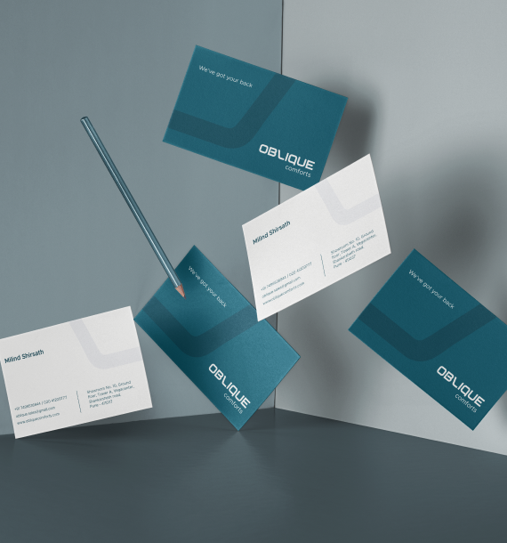
We designed the visiting cards with two main colours in consideration and the appropriate typography to make them more visually appealing.

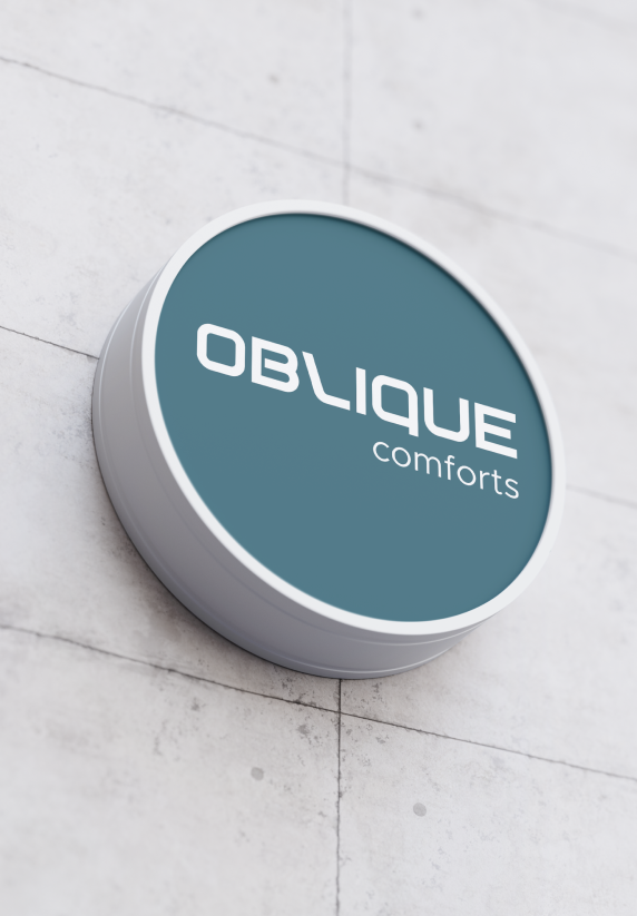
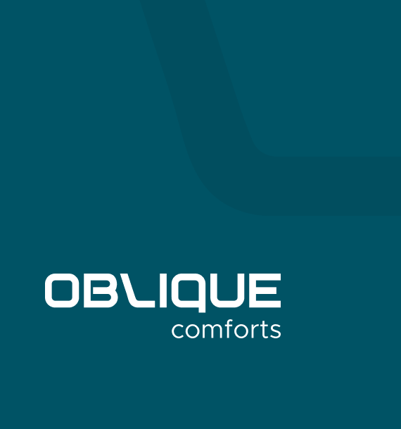
Designed like the letter 'L' the logo represents a seating arrangement. It is created in a way that appeals to the target markets.
Book everything in a snap.

To emphasize their brand personality, we strategically structured and updated their branding. We revised their logo, generated new brochures, and made all other necessary adjustments to strengthen their personality.
By simply replacing a contemporary seat for the letter L in the logo, we gave the oblique logo a distinctive look.
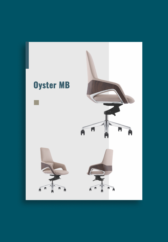
Taking minimalist style into account, we created the brochure with only the most significant and explanatory lines and images for the reader.
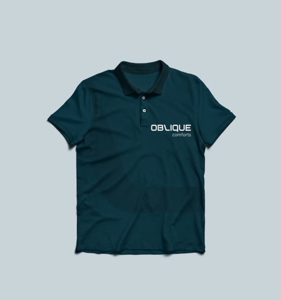
We created an oblique t-shirt using calm primary colours to keep the logo prominent where it belongs.