The Challenge
Contractify came up with a software that helps organisations stay on top of contract management. From creation over signature to renewal: Contractify aims to automate and streamline your processes as much as possible. Our goal was to build a branding system for Contractify that will help the brand to catch the right tone and send across the main message to appeal to its target group. The team was tasked with finding an elegant and sensible solution for the brand visual.

The icon of the logo formed base for the brand visual system
The icon comes from the logotype which is designed in a way to convey the meaning for which Contractify stands viz. collaborating in the best way possible to manage contracts. So, the icon formed the core element for the entire brand visual language.
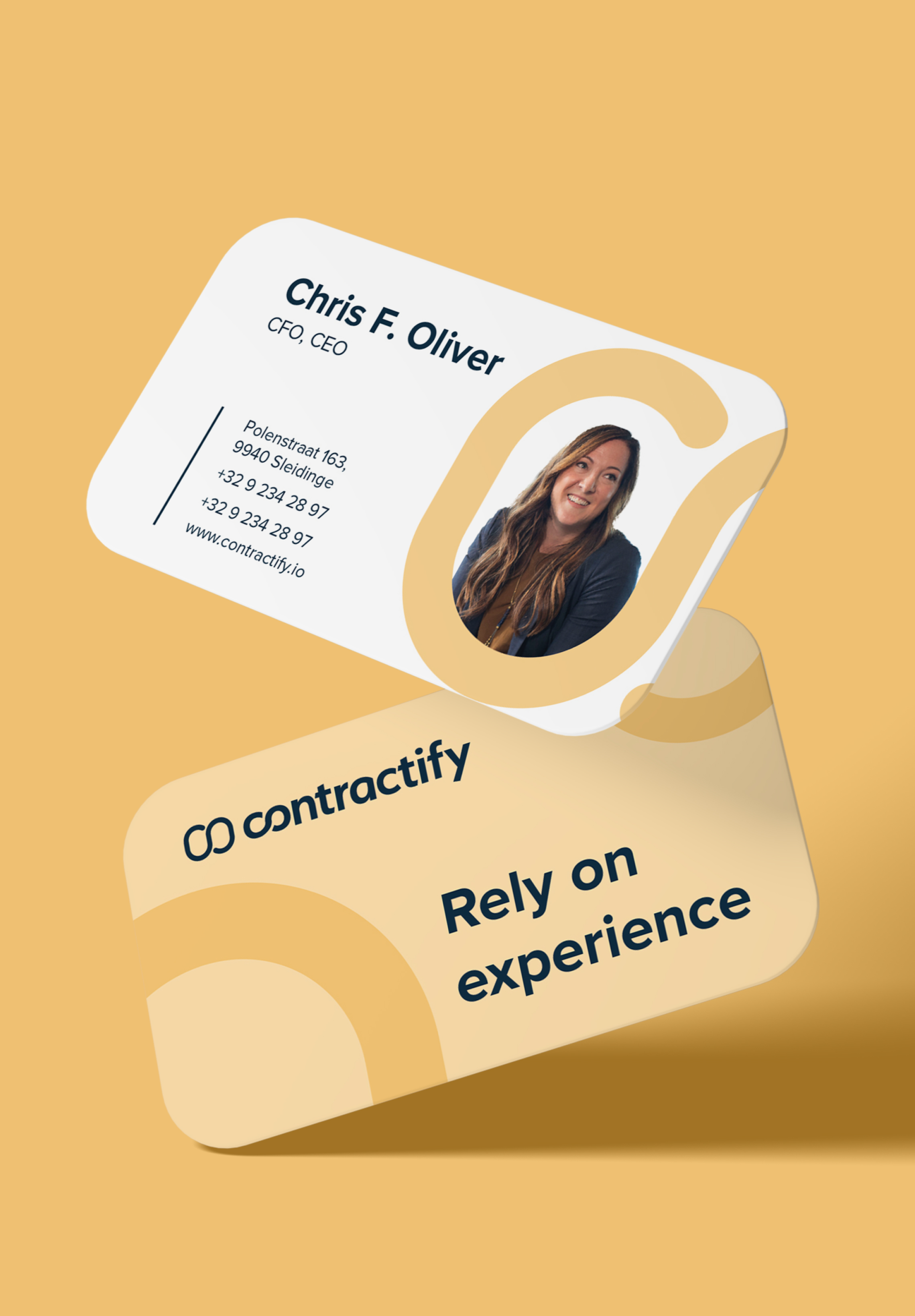
A business card with the brand’s slogan ensuring the right message is sent across. Also, the use of image helps in building reliabilty and transparenc
A business card with the brand’s slogan ensuring the right message is sent across. Also, the use of image helps in building reliabilty and transparenc
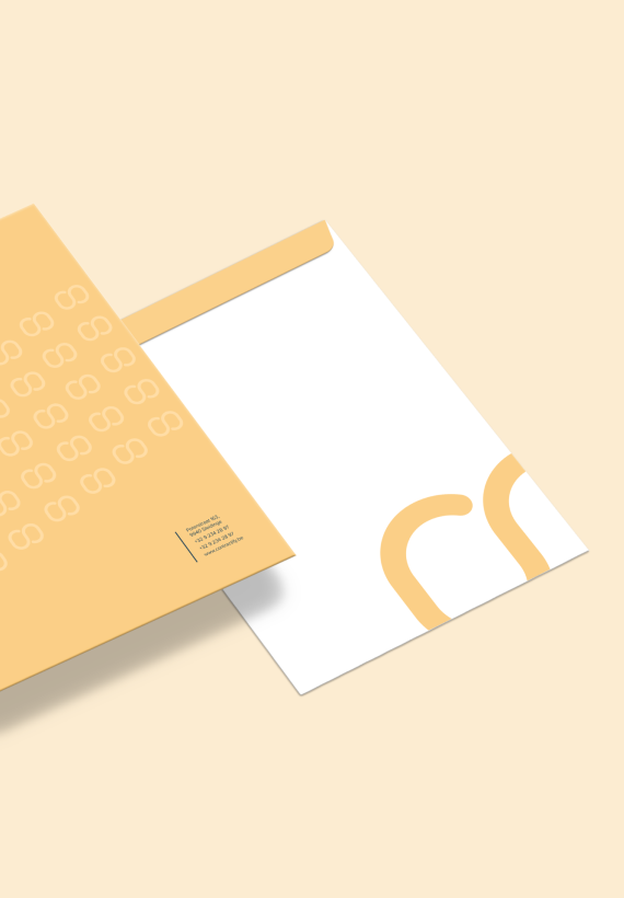
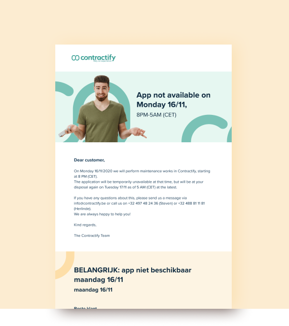
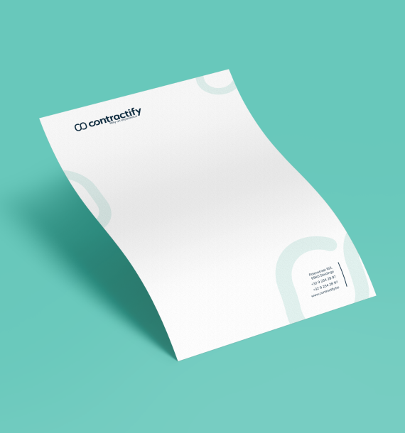
Covering all the brand touchpoints in brand’s design system.

The only contract management tool you’ll ever need

The colour palette has been created to reflect the brand voice. It’s playful, it’s casual, it’s fresh at the same time it is not over the top and effortlessly reflects the brand.
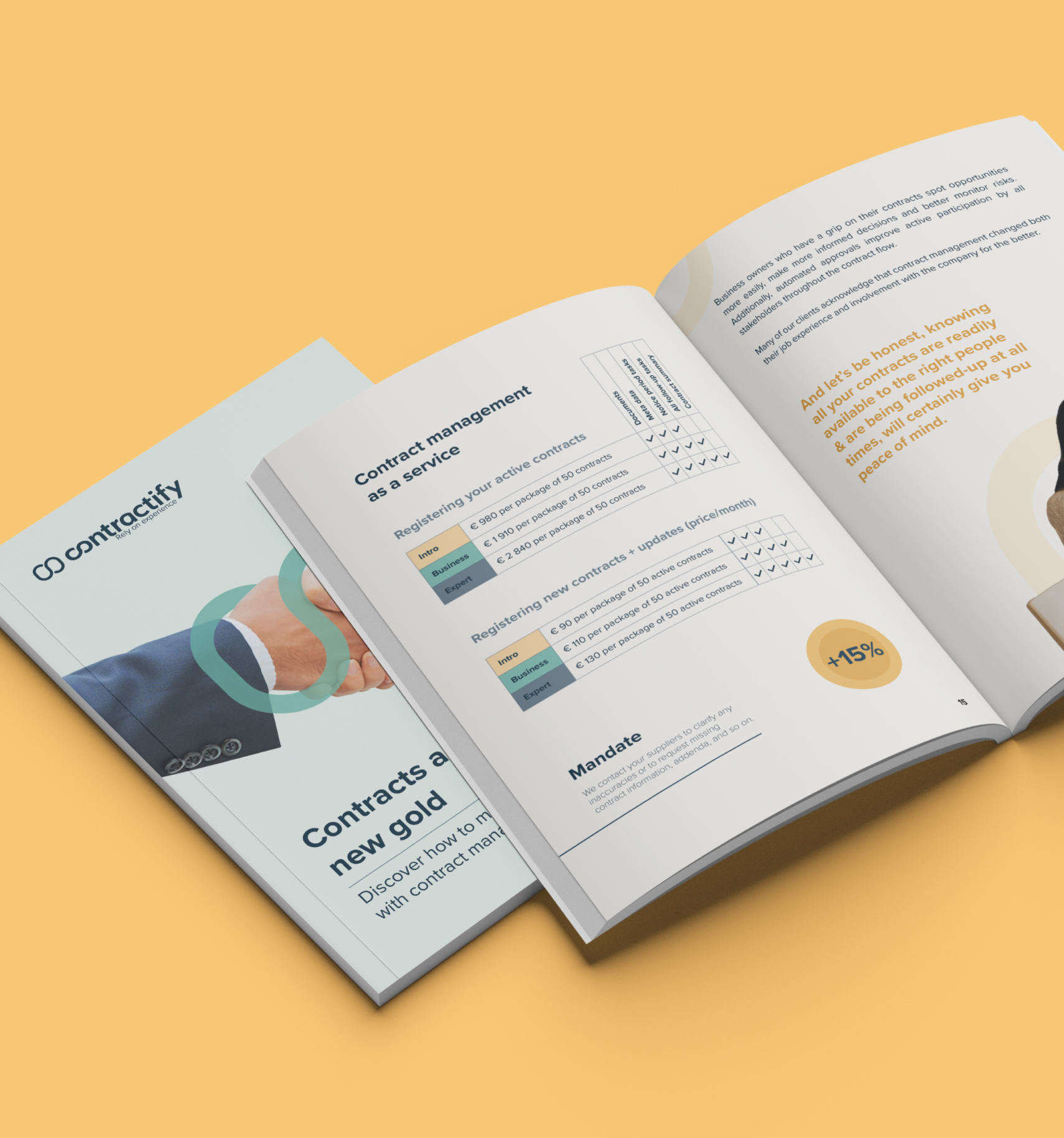
A brochure designed to describe the company services in detail along with the imagery incorporated beautifully with the visual language.
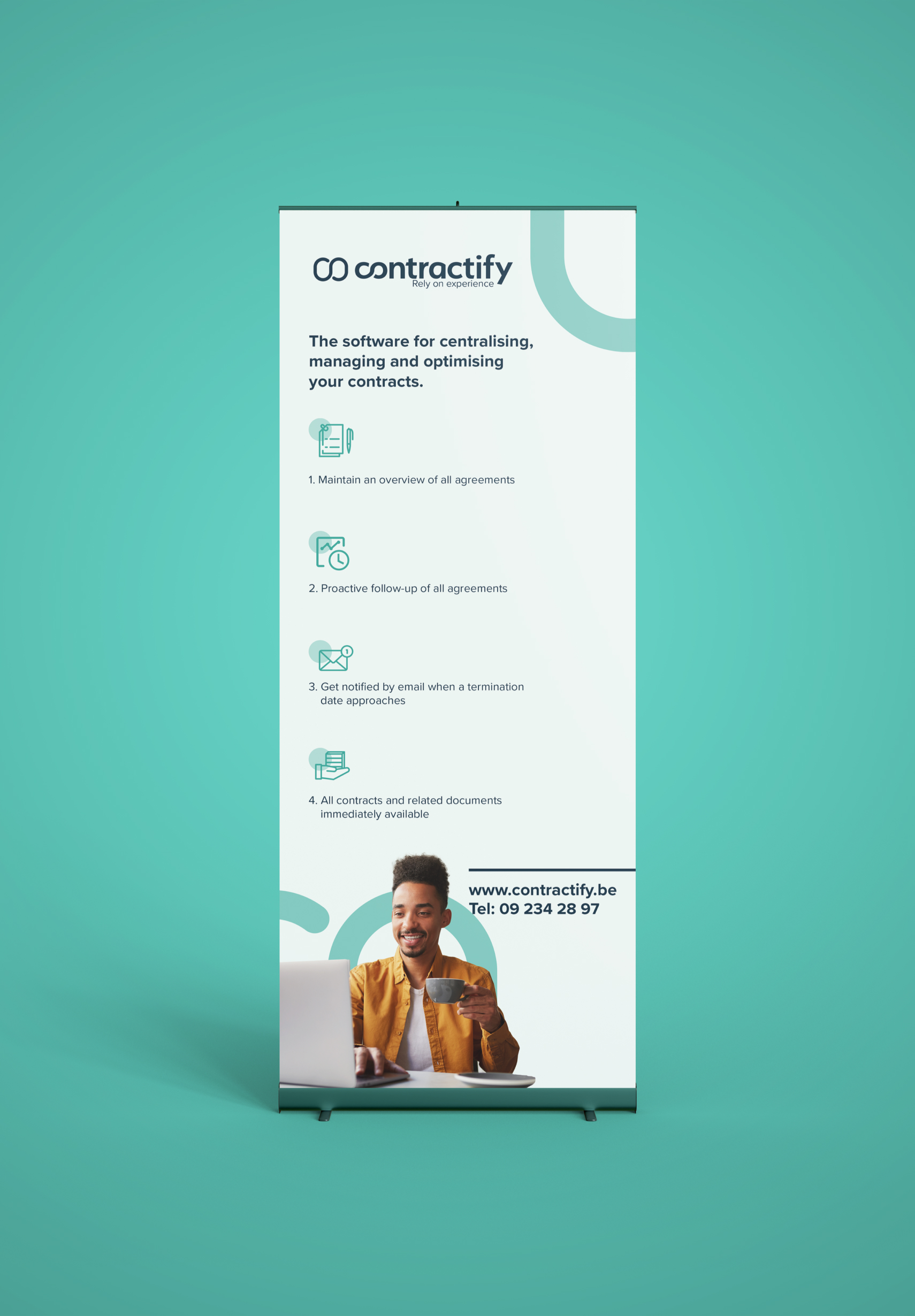
A standee with the right details with apt icons and imagery is a great way

Minimal icons to maintain brand image